
BODY IN MOTION
A Practice Finally in Motion
When a fast-growing physio group built their first owned premises, the brief needed to match the business, not just the building.
INDUSTRY: Healthcare (Physiotherapy)
LOCATION: 46-48 Girven Road, Mount Maunganui
TENANCY SIZE: 267sqm (Clinic) + 145sqm (Head Office)
TEAM SIZE: 29
The call came from a project manager…
Body in Motion had been running a converted state house on a site they owned in Mount Maunganui… dated, increasingly impractical, and due for demolition. Beside it, a newer clinic handled physio consult rooms and a Pilates rehabilitation studio.
The business was growing quickly, as it had been for some time, and the owner had made a significant decision: to develop the site properly. A new three-level building. A purpose-built ground floor clinic bringing physiotherapy and hand therapy under one roof for the first time. And a management office on the top floor - a proper home for a team that had, until now, been working out of whatever space they could find.
The call I got wasn't from the owner directly. It came from the project manager coordinating the base build - architects, consents, services consultants, all the moving parts of a new construction project. He needed someone to take on the interior design for the two tenancies Body in Motion would occupy.
What became clear quite quickly was that his expertise was the build itself. He was excellent at coordinating trades and managing the construction process. But the interior, the question of how people were actually going to use these spaces, and what they needed to use them well, hadn't really been worked through. Which, given they were already mid-build, was going to require some catching up.
"Haere Mai, Welcome" - from the moment you arrive, this building communicates something intentional.
The building had been designed from the outside in
This is something I've noticed across many years of working with base build architects: they're solving a site problem. How to fit a building on a piece of land, how to make it structurally sound and compliant, how to create a form that reads well from the street. Those are real problems requiring real expertise.
But interior functionality - how natural light reaches people working at desks every day, whether a floor plate actually makes sense for the humans inside it, how a clinical workflow moves through a space - those are a different set of questions, and they don't get resolved by the same process.
In this case, the building's footprint was an unusual shape, chosen because it fitted most efficiently on the site.
On the ground floor, that geometry made planning a clinical space genuinely tricky - the consult rooms needed to be right-sized and properly functional, with storage designed around how the team actually worked, particularly for hand therapy where the specialist equipment and materials are significant. Getting ten rooms to work well within those constraints required careful space planning and custom cabinetry designed around real clinical practice, not just what would fit.
Upstairs, though, the thing that struck me most immediately was the windows. There weren't enough of them. The base build architect had resolved the exterior elevations without really considering the quality of light that would reach the people working inside every day. We got additional windows added to the specification before it was too late. It's the kind of intervention that sounds straightforward but changes everything about how a space feels to inhabit. If you're building from scratch, the opportunity to get natural light right is there - but only if someone's asking for it before the walls go up.
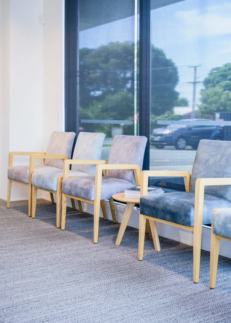
A waiting area that feels considered rather than clinical…
and clinic rooms with privacy without feeling closed off.
The ground floor: ten rooms, a wave, and a warm welcome
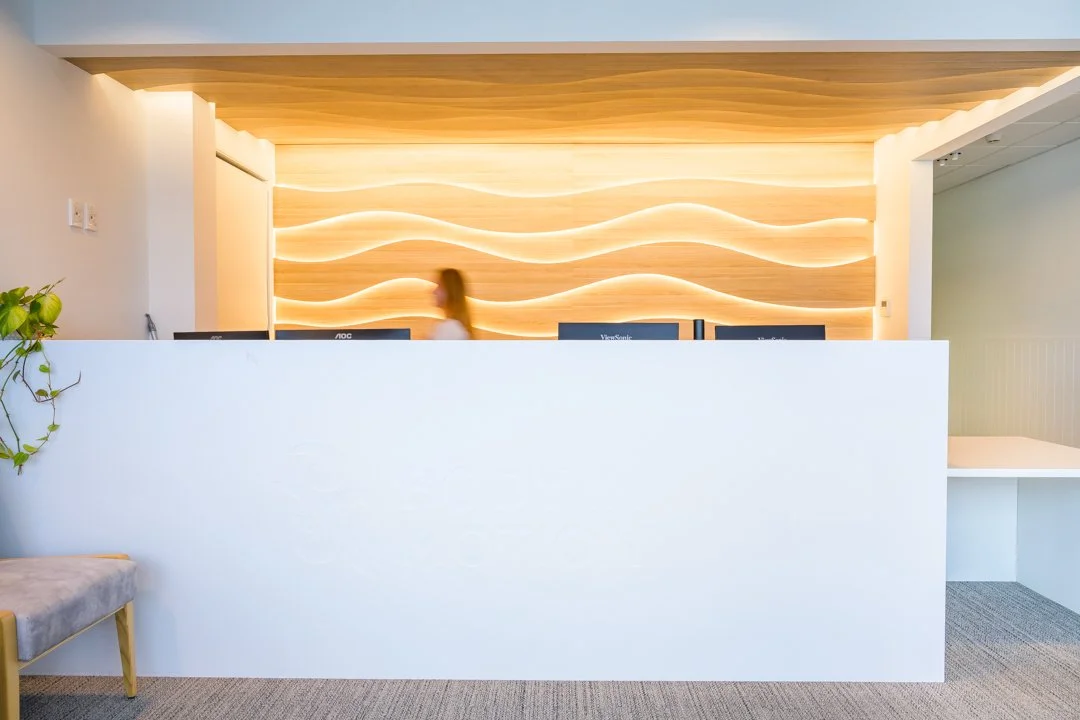
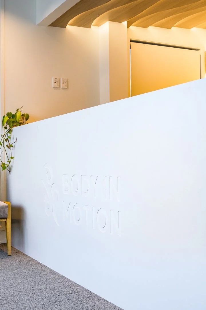
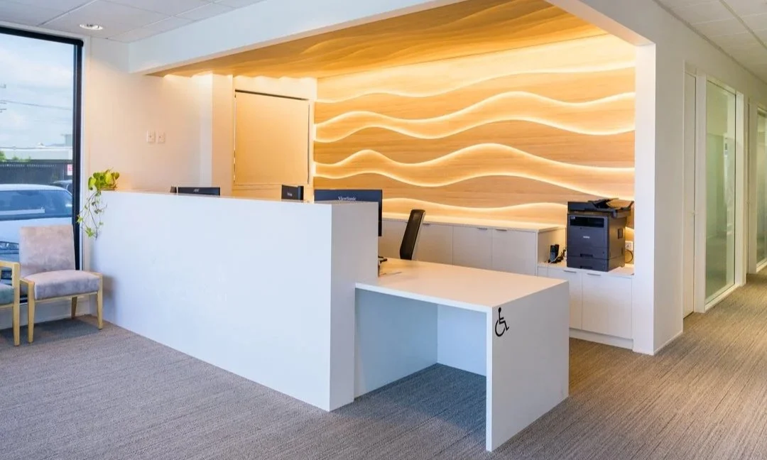
The clinic reception is the first thing a patient encounters, and it does a remarkable amount of work in a short space. The desk is white solid surface - clean, confident, with the Body in Motion branding embossed into the face - and behind it, filling the entire rear wall and wrapping onto the ceiling above: warm pale timber panels, cut and layered into undulating wave forms, with LED strip lighting threaded between each layer. The effect is warm and alive, and completely unlike anything a patient would expect to walk into.
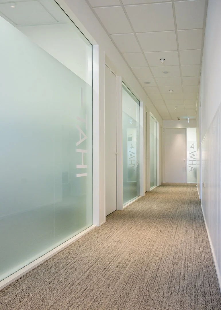
The waiting area sits to the side - pale upholstered armchairs in natural oak frames, a generous window onto the street - and from there, a corridor runs the full length of the consult rooms, each one identified in Te Reo Māori. Tahi. Rua. Toru. Wha. Full-height frosted glass partitions run along one side, giving privacy while keeping the corridor light and open. It reads as calm and ordered - exactly what you want in a healthcare environment, and exactly what a converted state house never quite managed to be.
The wave feature wall - warm timber, layered and backlit - makes an immediate impression in the clinic reception.
The management brief: starting with "ten desks and a boardroom"
When I sat down with the management team to talk through the upstairs tenancy, the initial brief was familiar. Ten desks. A boardroom. Clean and practical.
It's a reasonable starting point, but like most initial briefs, it was a description of what they assumed a management office was supposed to contain, rather than a considered response to how the team actually needed to work. A few things shifted when we dug in.
The boardroom, it turned out, was used maybe once a month. That's a lot of floor space dedicated to something that happens twelve times a year. So instead of a single large formal room, we explored two smaller meeting rooms - useful every day for internal catch-ups and smaller team meetings - with an operable wall between them that could fold back when a larger gathering was needed. The brief word "boardroom" became something much more useful: a flexible system that works on an average Tuesday, not just the quarterly presentation day.
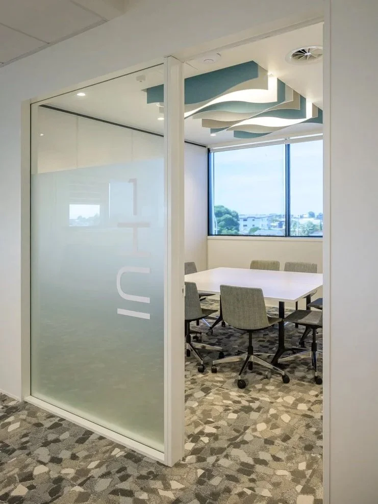
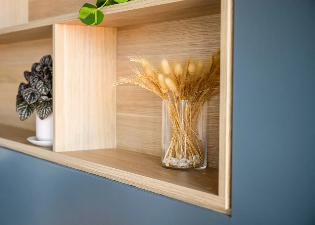
"Hui" meaning meeting, in Te Reo Maori. The language of place running through both floors.
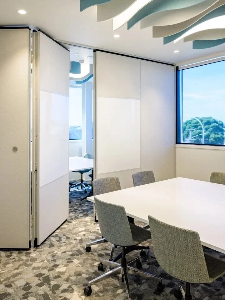
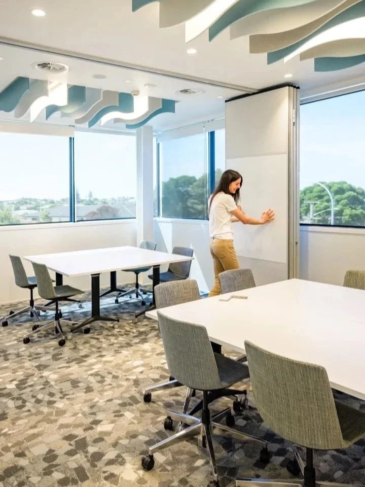
Two meeting rooms, one operable wall - a boardroom when you need it, two everyday rooms the rest of the time.
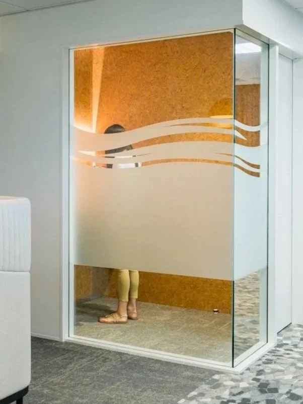
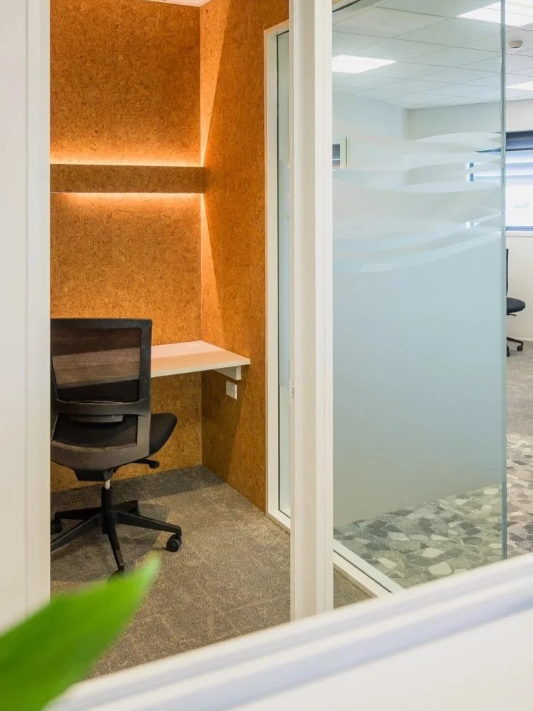
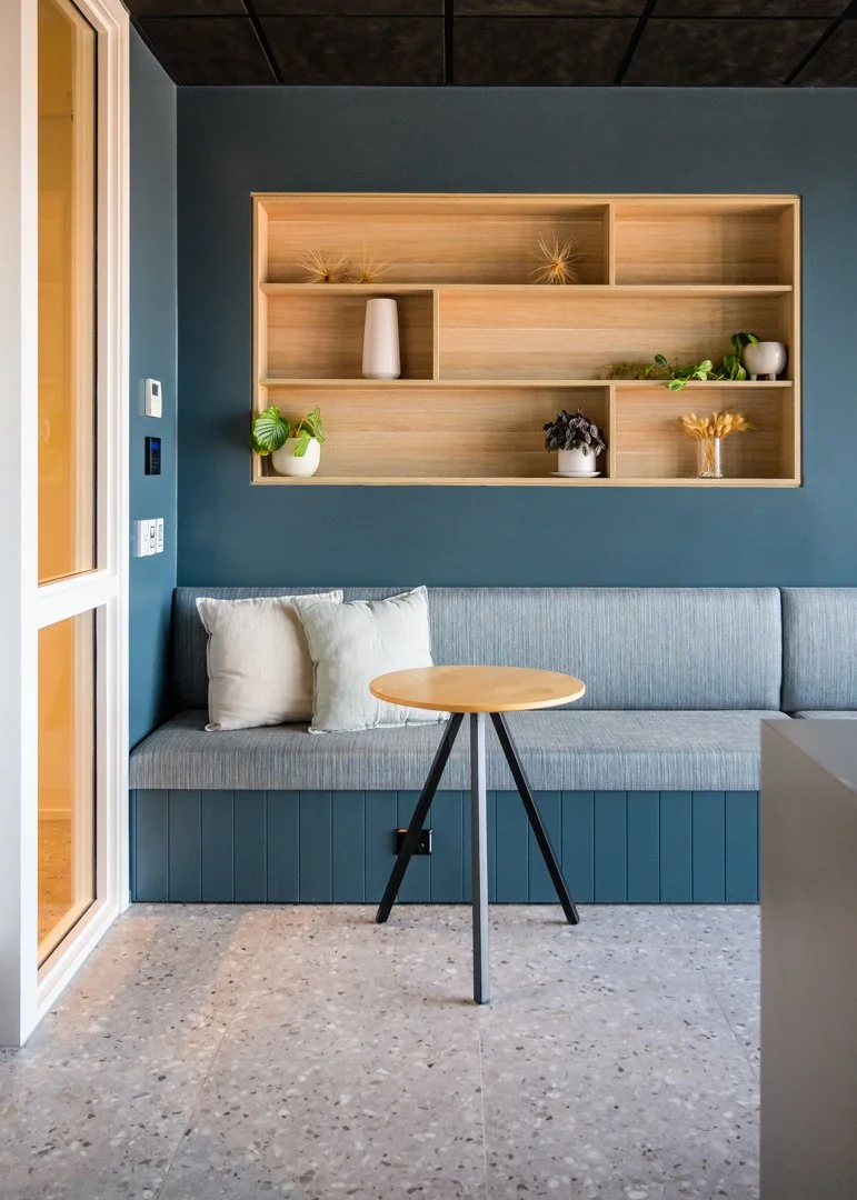
The team had also spent years adapting to shared and makeshift spaces, which meant they were, to varying degrees, used to being able to close a door when they needed to concentrate. Moving that team directly into full open plan was likely to create friction. So we built in quiet spaces - a phone booth for private calls, and high-backed booth seating for informal focus work - tucked away from the main workspace, with the kind of acoustic separation that lets the open plan actually function as open plan.
And at the back of the tenancy, in what was an awkward corner of the floor plate, we created a distinct informal meeting zone - the space that came to be known as the sunset corner - positioned away from where visitors and meeting activity would naturally land. The logic of public to private runs through the whole tenancy: meeting spaces near the entry, open workspace in the middle, collaboration and quiet functions further back.
Growth planning: designing for the business they were becoming
The initial brief was for now. When I asked about what growth had looked like over the previous few years, the answer made it clear the business had been expanding rapidly - and there was no real plan for how the space would need to accommodate more of that.
A tenancy should work for seven years. Which means you need to look back at the last seven and make some honest projections forward. You don't need to fit out for thirty people when you currently have ten, but you do need to know where the next six desks go, what moves when the team expands, and whether the layout can flex without requiring a full redesign. We planned for nineteen work settings in the end, and they've needed them all.
“Rachel from Bubble provided valuable insights during our design process that significantly impacted the final fit-out and finish of our new building... her ability to understand our needs and translate them into a design that reflected our company culture and practical requirements... her expertise in space planning, which ensured we maximised the functionality of our new office... and her guidance in selecting finishes and creating a cohesive aesthetic that is both professional and welcoming.”
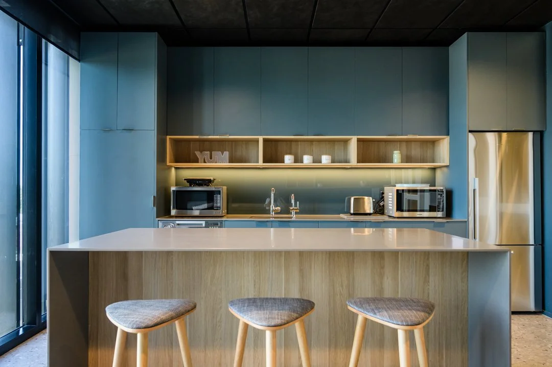
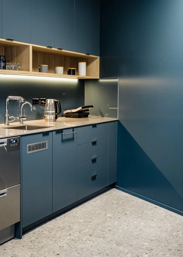
Two kitchens, same palette, different light
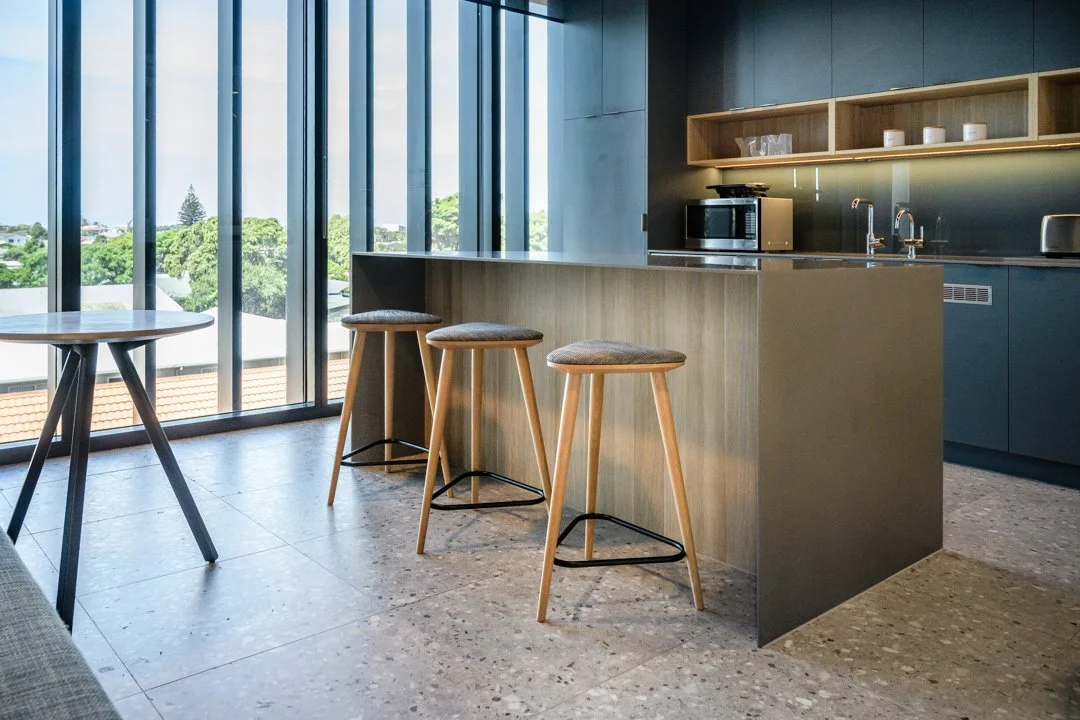
Upstairs, the staff café is generous and bright - full-height glazing along the eastern wall, looking out over the rooftops toward Arataki and the water beyond. Terrazzo floors. A warm oak island bench. The Resene "Atomic" walls picking up their green undertone in all that daylight, "Winter Sky" melteca cabinetry reading as a soft warm blue-grey. A space that earns its view.
Downstairs, the ground floor kitchenette uses the same palette exactly. Same Atomic walls, same Winter Sky joinery, same oak detailing. But with limited natural light - a single window rather than a full glazed wall - the colours feel cooler, moodier, more emphatically blue than green. It works in both settings, but it looks like a different room, because light changes everything.
This is one of the things I find myself using as an example when I'm talking to clients about how materials actually behave in a space. The sample board is not the room. The room is the room - and the room always has a specific quality of light that a sample board never will.

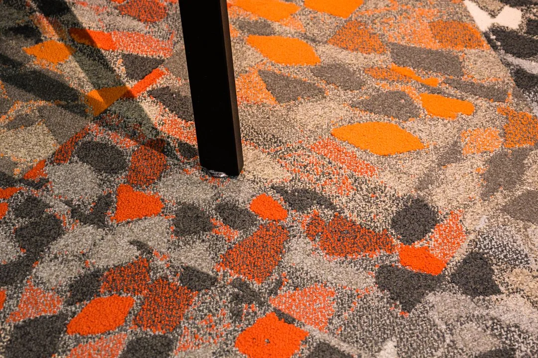
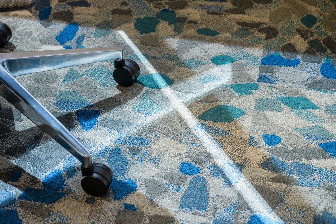
The carpet as a compass
I love it when I visit a completed project and keep finding things. In my opinion, that's what good design does - it reveals itself over time rather than declaring everything at once. For this project, the upstairs floor uses four different carpet tiles, chosen to do the job of zoning the space without walls or signage.
In the meeting rooms and for the main circulation, a cool-toned pattern in grey and stonearansitions into cool blues + greens in the meeting rooms - calm, ordered, appropriate for focused work and formal conversation. Then in the sunset corner at the western end: a warm, rich pattern with amber and terracotta merges from grey base in the informal team collab are - the floor itself signalling that this is a different kind of space, before anything else about the room does.
It's the kind of decision that shapes the experience of moving through a building without the person moving through it ever being able to articulate why one zone feels different from another. They just know it does.
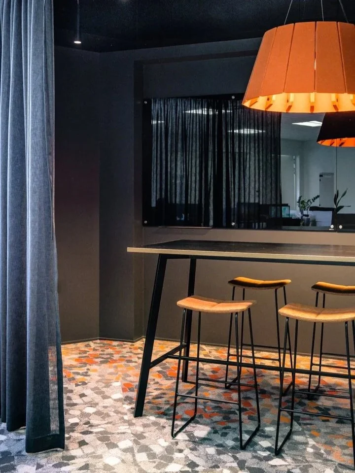
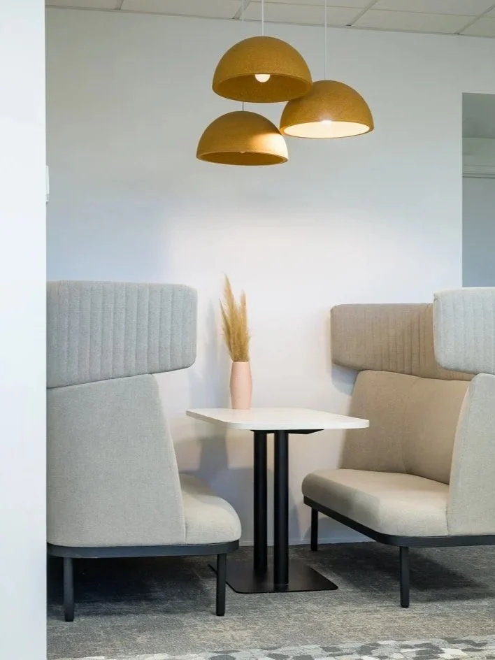
The corner with the sunset
At the far western end of the management floor, tucked into what could easily have been dead space, sits the informal team meeting area - and it is the most deliberately dramatic moment in the building. Dark walls, a deep charcoal ceiling, full-length grey drapes that can close the space off entirely.
A large amber acoustic pendant - pleated, textured, glowing - drops low over a black high table with terracotta-upholstered stools. The carpet beneath is warm orange and grey. In the late afternoon, when the western light shifts, the whole corner comes alive in a way that the rest of the building doesn't. It reads as entirely different - and intentionally so. Somewhere to end the day, to gather informally, to have the kind of conversation that doesn't belong in a meeting room.
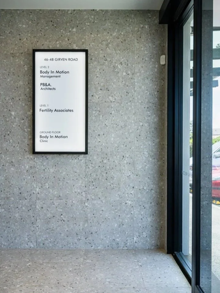
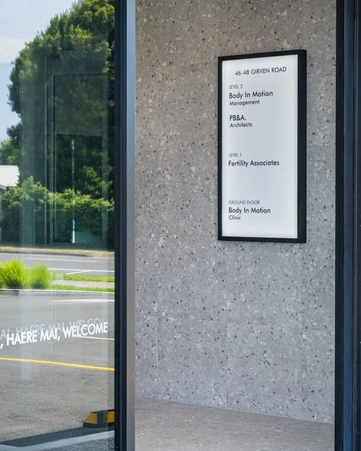
The shared lobby sets the tone for the whole building… terrazzo wall cladding and floor tiles specified to carry the design language through before you reach either tenancy.
A building that feels like one thing
Because Body in Motion weren't the only tenants (Fertility Associates took Level 1, PB&A Architects the other half of Level 2, and the owner had planned the building partly around the income from leasing those floors) there was a question that extended beyond the two tenancies we were fitting out: how did the shared spaces feel?
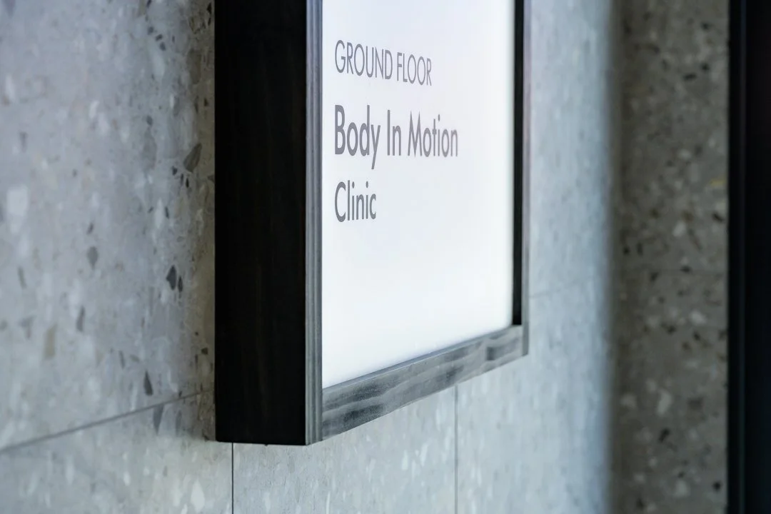
Entry lobbies, stairwells, lift interiors. These are the connective tissue of any multi-tenancy building, and they're frequently where design thinking stops, because no single tenant owns them and no one is naturally incentivised to invest in them. The lobby you walk into at 46–48 Girven Road - terrazzo wall cladding and floor tiles, the directory board, the "Haere Mai, Welcome" etched into the entry glass - didn't happen by accident. Specifying the finishes for those shared areas was part of the brief, and part of what made the building work as a whole and as a leaseable asset.
A patient arriving at Body in Motion's ground floor clinic should move through spaces that feel connected to what follows. A prospective tenant looking at Level 1 should arrive into a building that already reads as considered. Both things matter. In a new build, the opportunity is everywhere - but only if someone is thinking about the whole.
Looking east out over Arataki - a staff café that earns its view.
The moment I keep coming back to is the management team finally having their own space. Not a back office in a state house, not a borrowed corner, not wherever they could find room. A proper home for a team that had built something significant - looking out over Mount Maunganui from the top floor of a building their business now owned. There's something quietly satisfying about that, about a business owner seeing his team settle into a space that finally reflects what they've built together.
BUBBLE INTERIORS’ SCOPE:
Space Planning, Concept + Developed Design for selected tenancy
Detailing of custom boardroom credenza, copy + staff kitchen cabinetry
Key interior plans + specifications for Base Build Consent
Procurement of full FF&E package
PPROJECT TEAM + SUPPLIERS:
Main Fit-out Contractor: Marra Construction
Furniture: Acorn Furniture, Harrows, Mobel Group, ISSA Furniture
Photography: Jay Drew
Project Completed February 2023
See more Case Studies:
If you'd like to read more about why the briefing process is the most important part of any office project, I've written about it over on the Workspaces That Work Substack.