
SEEKA
Designing for Connection + Cross-pollination
A 360° approach to culture… how strategy-first design turned a legacy site into a social anchor.
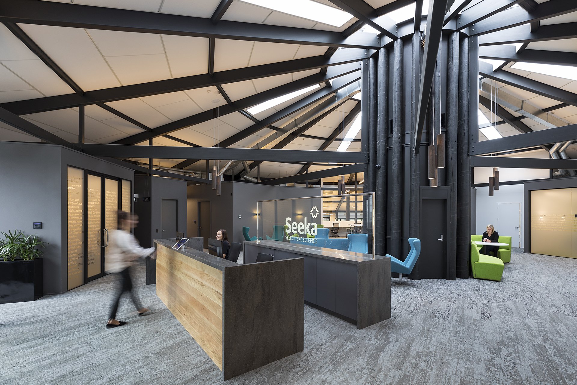
A reception that sets the tone - grounded and confident from the moment you arrive.
INDUSTRY: Agribusiness
LOCATION: Te Puke, Bay of Plenty
TEAM SIZE: 78
TENANCY SIZE: 1,358sqm
COMPLETED: 2017
It started as "just finishes"… until the real problem showed up
When Seeka purchased the former Kiwi 360 site in Te Puke, they weren't just acquiring a building… they were creating a new centre of gravity for their team. The site is distinctive: a circular structure with a dramatic cluster of central columns rising through a high, exposed roof, the kind of architecture that makes an immediate impression. Page Henderson Architects were already well into the base build refurbishment when we were brought in by referral, initially to support with interior finishes.
That's often where a project like this would start and end. Finishes chosen. Brief closed.
But as the build progressed, Seeka's project champion recognised something that the finishes alone couldn't fix. Even in a new space, the layout was quietly recreating a familiar pattern - teams settling into separate zones with limited natural overlap, and shared spaces that people moved through quickly rather than stopped in. The central column cluster, which had every potential to become the social heart of the building, was on its way to becoming passive circulation. The kitchen risked being functional and forgettable. And because the site is out of town, there was a real question hanging over it: once the novelty wore off, would people have a reason to linger?
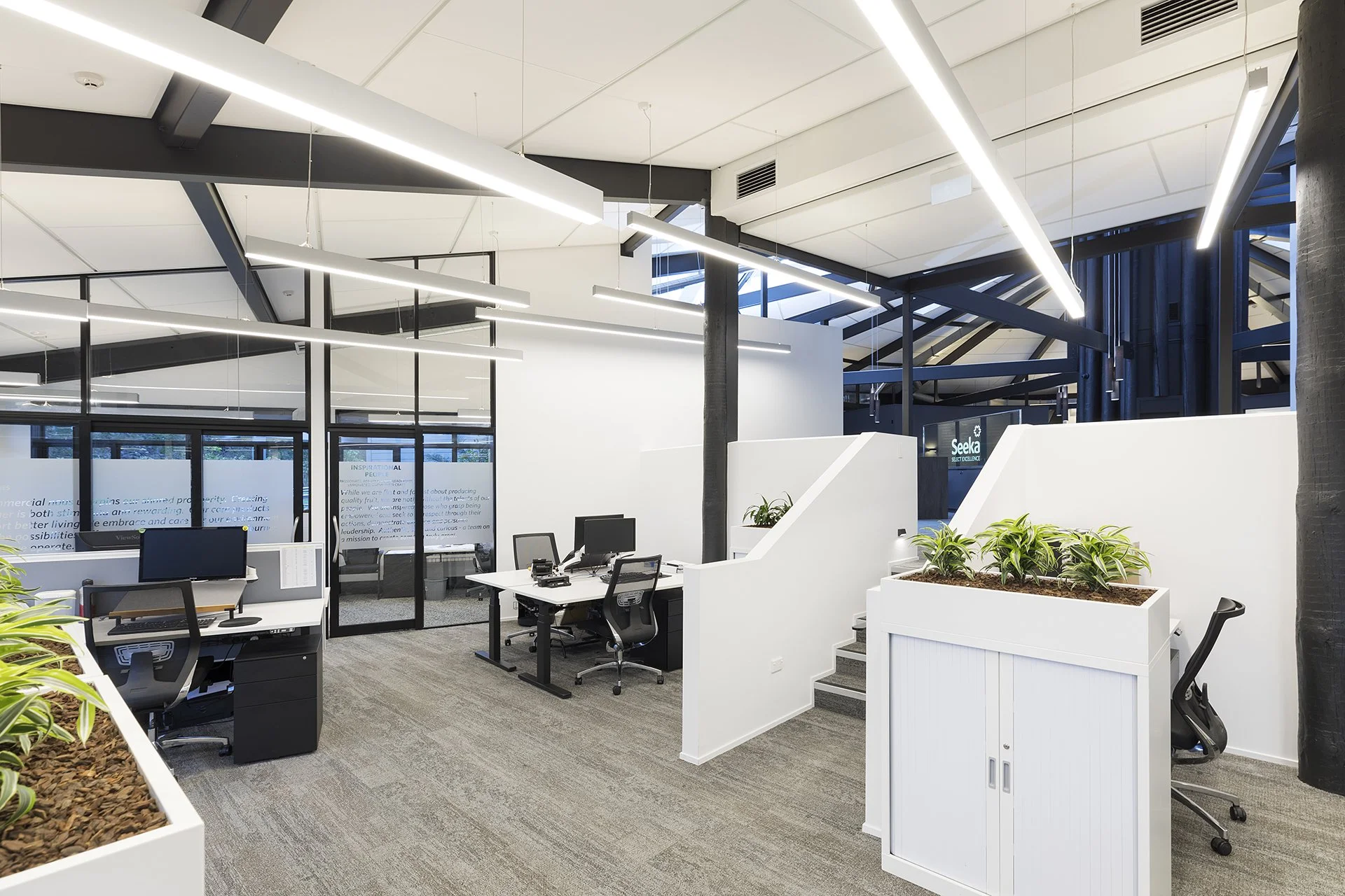
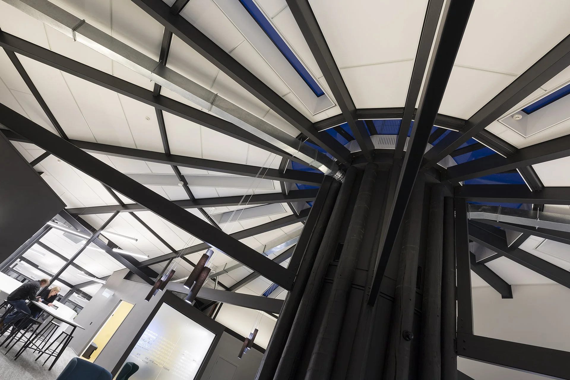
The separate team workspaces that splayed off the central core
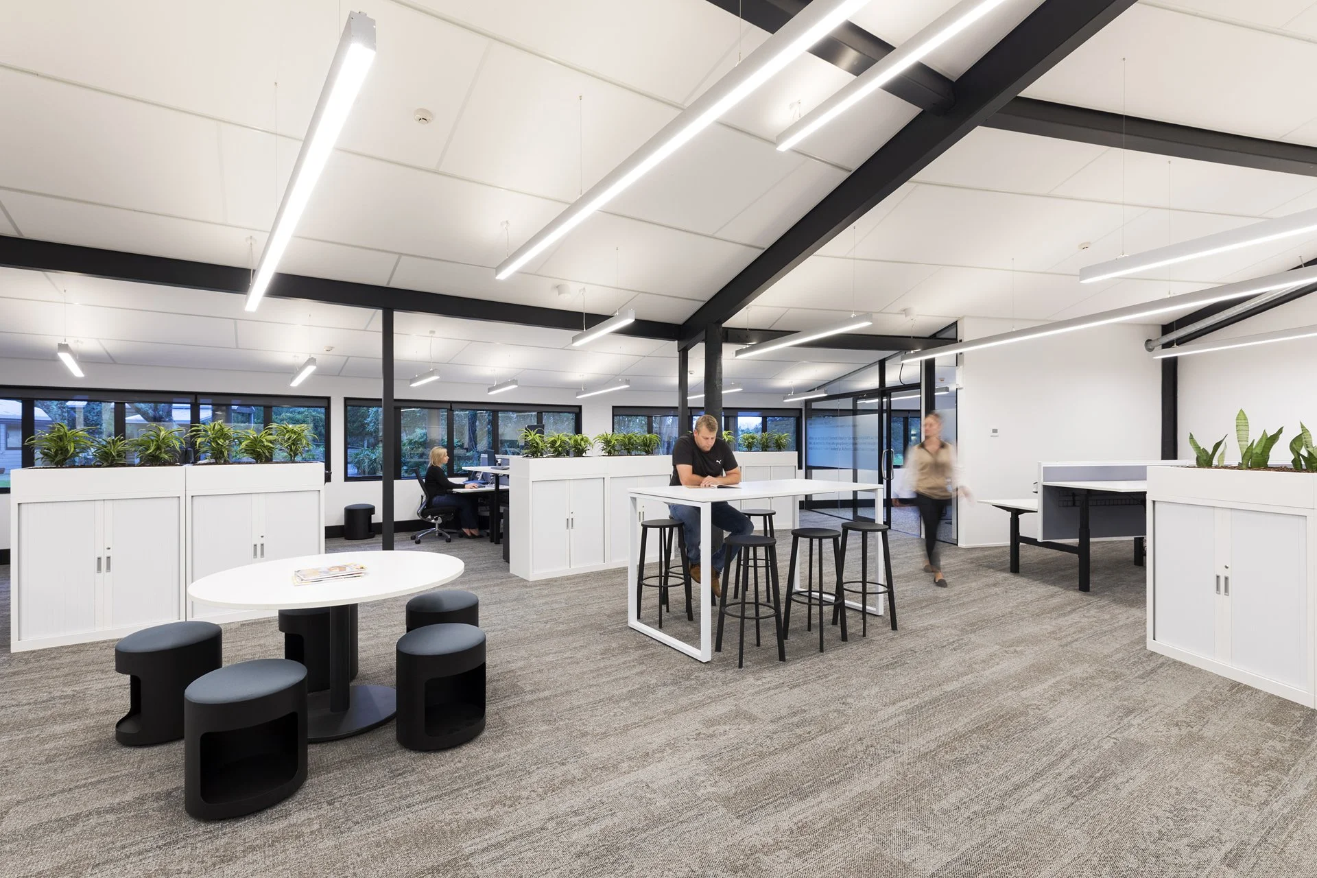
We focused on the quiet decisions that shape culture
The base build was already underway, which meant the architecture wasn't going to change. What was still available - and where the real leverage sat - was flow, furniture, and the social weight of key zones.
Because Seeka's site is out of town, the brief underneath the brief was this: design a reason for people to want to stay. Not through policy or culture programmes, but through the everyday experience of the space itself. If the building was going to become a genuine centre of gravity for 78 people, it needed to feel like somewhere worth being at the end of the day, not just somewhere to get the work done and leave.
That shaped every decision from that point on.
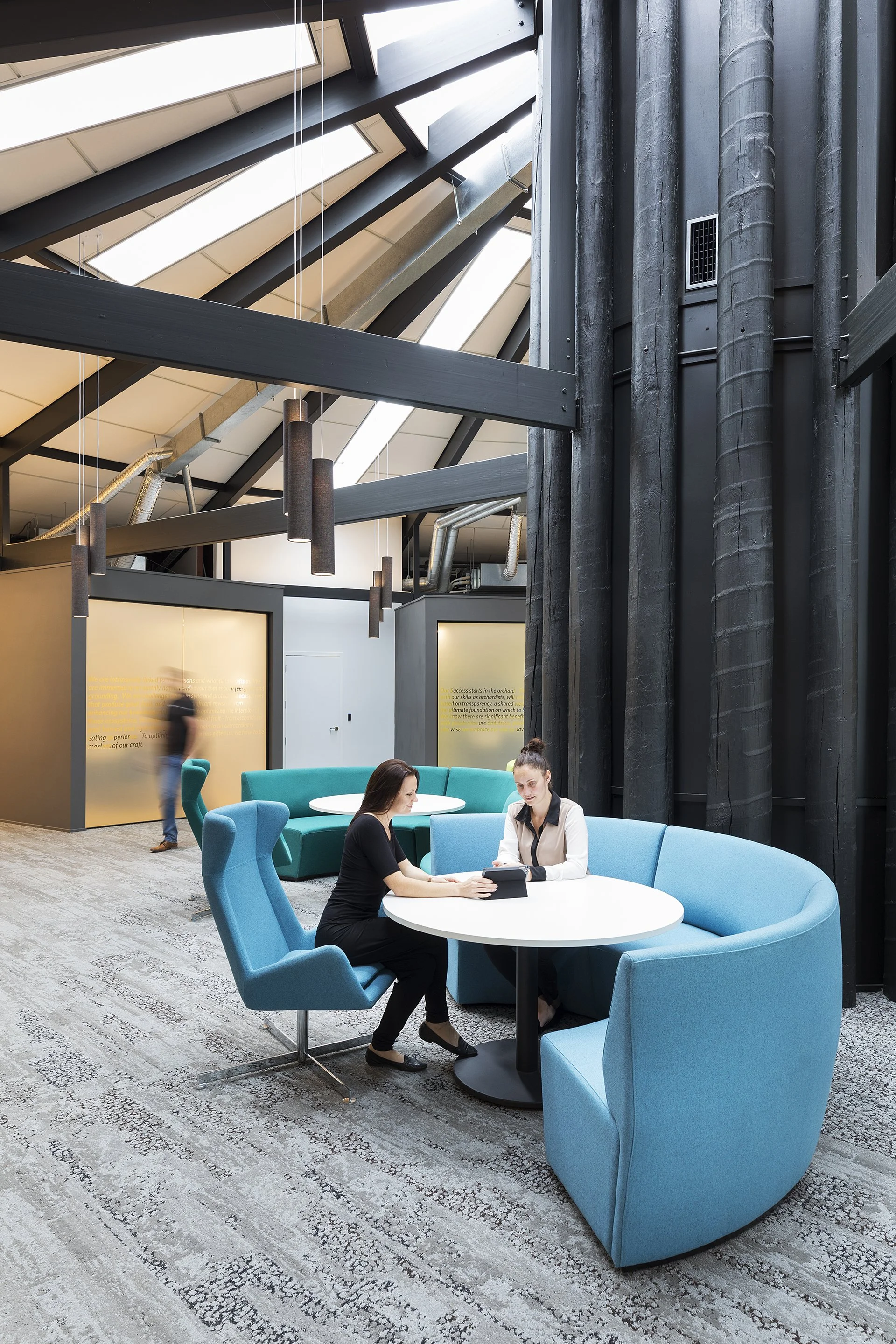
The building had character. The strategy made it connective…. accidental "bump space" built deliberately.
The turning point: treating the centre like a hub, not a hallway
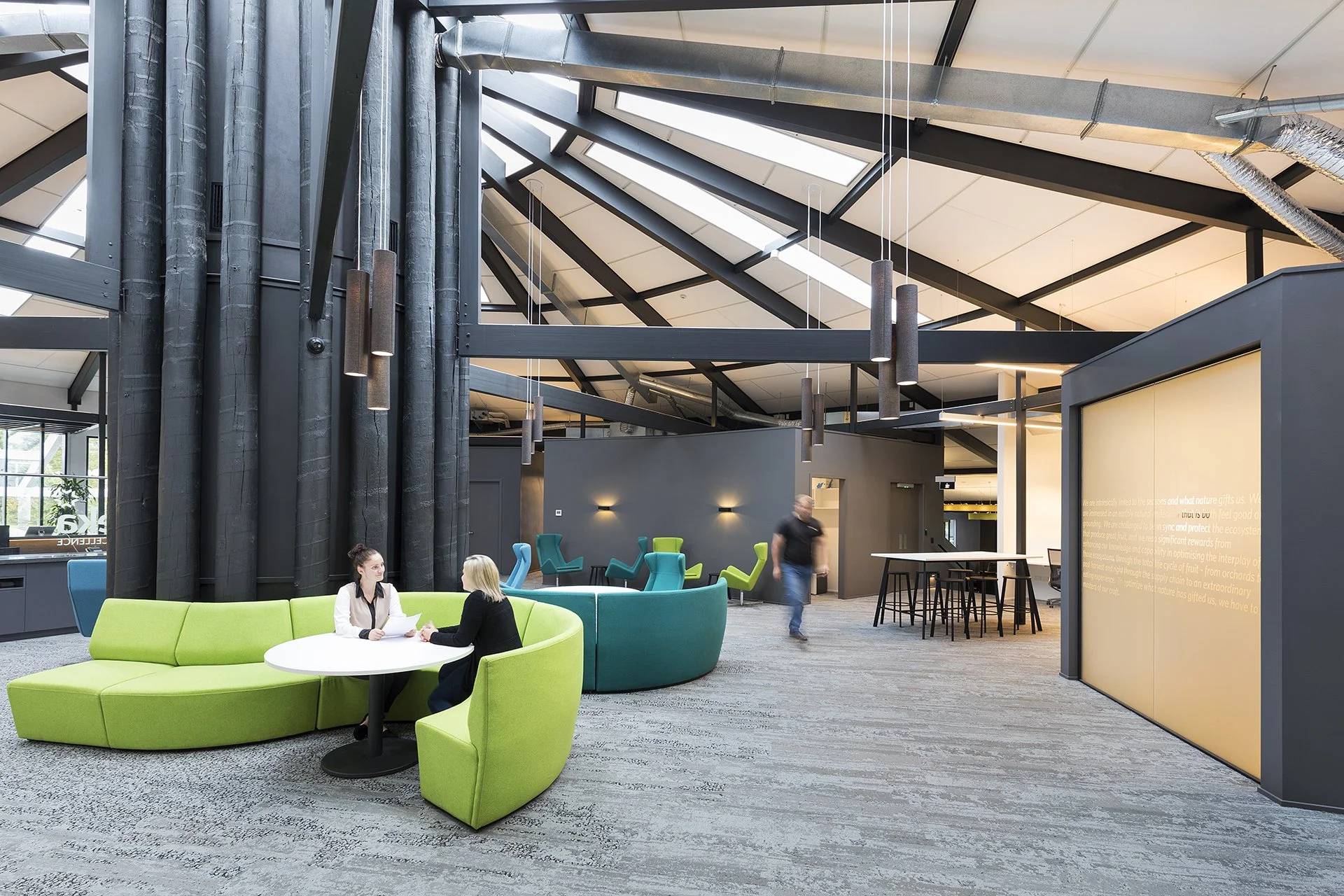
The central column cluster is the architectural heart of the building - an extraordinary grove of dark structural forms rising through the full height of the space. The risk was that people would simply walk around it on their way between teams. We treated it as a destination instead.
We layered informal settings around the core - curved circular banquettes, loose wing chairs in teal and lime, small round tables, multiple ways to arrive into a conversation without needing to book a room. Different scales for different moments: a quick two-person catch-up, a team huddle, a casual debrief. The column cluster became the reason people's paths crossed rather than the thing they navigated around.
The colour palette, Seeka's own brand tones of teal, blue and fresh green, made the zone feel like an extension of the brand rather than generic contract furniture.
Not a staff kitchen… a cafe space designed to make hanging out feel natural.
The café became home base, and connection followed
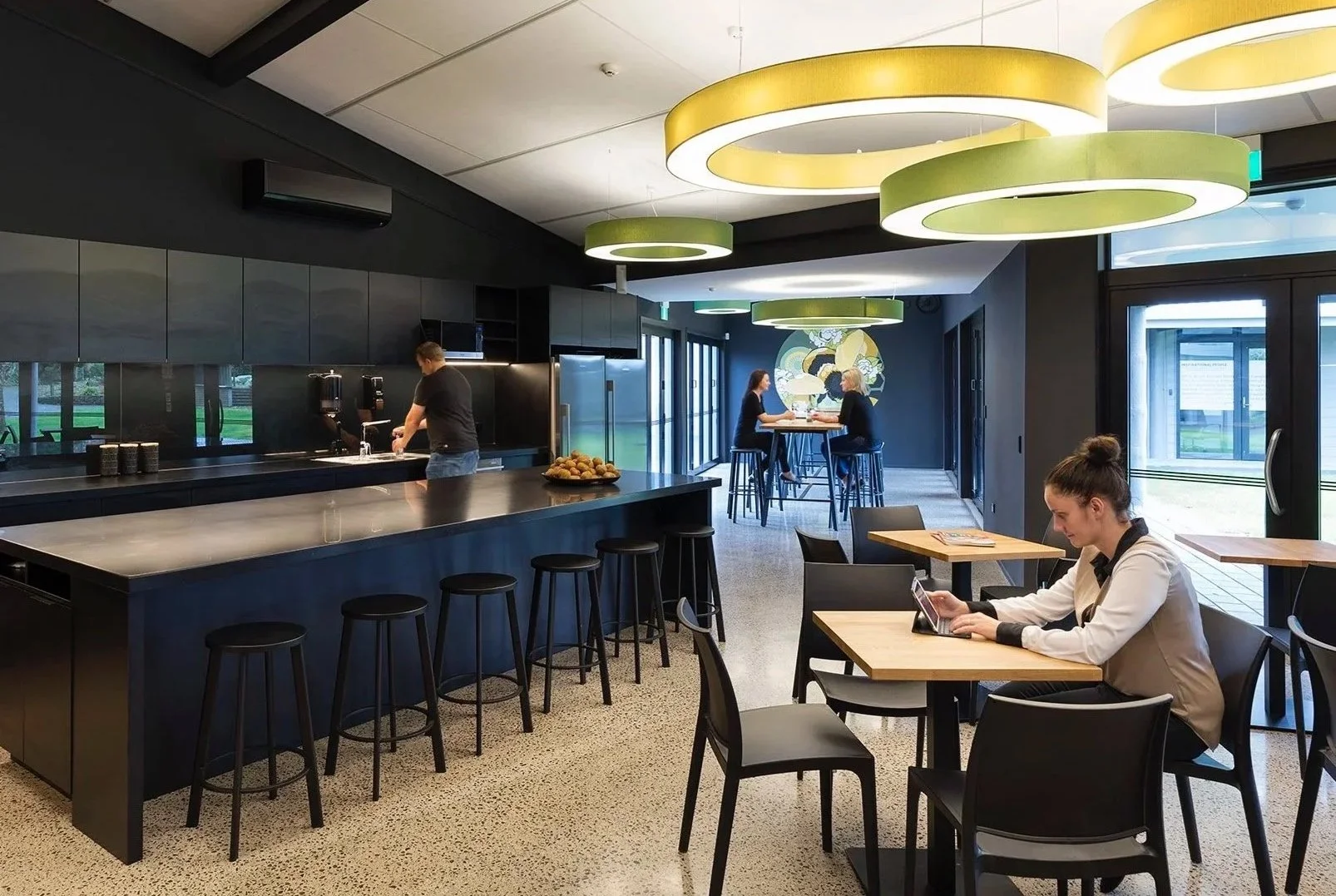
Most staff kitchens are forgettable: practical, neutral, somewhere you pass through. That wasn't going to work for a site out of town, and it wasn't going to work for a team of 78 who needed reasons to move across the building and into each other's orbit.
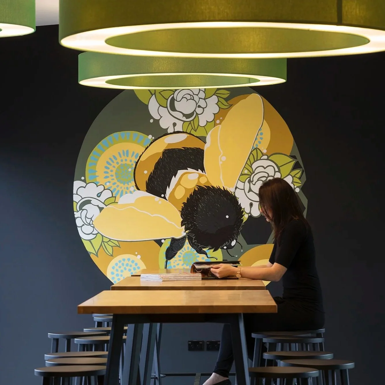
We treated the café as a hospitality space rather than a workplace amenity. All-black joinery and walls, a generous dark stone island bench, terrazzo floors, and those circular pendant lights in Seeka's kiwifruit green - a deliberate visual nod to the orchard and the brand, and impossible to ignore.
The murals across the walls told Seeka's story in two registers: richly illustrated botanicals, bees and kiwifruit in one zone; hand-drawn white line work across dark walls in the dining area, depicting the landscapes and characters of the Bay of Plenty. It wasn't decoration. It was identity made spatial.
Different ways to sit and gather - café-style dining, bar perches, casual spots - meant the space worked before work, at lunch, and especially at the end of the day.
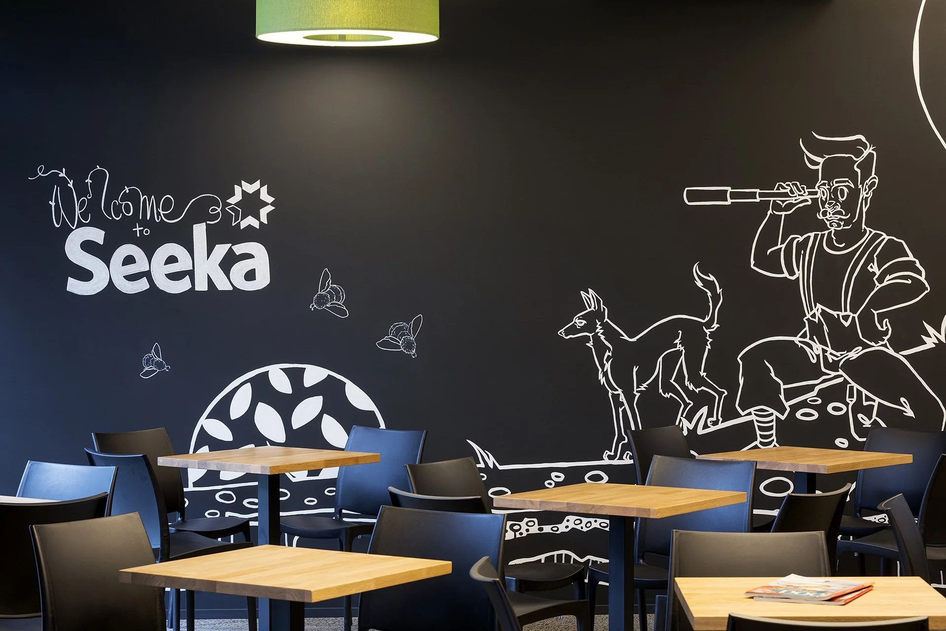
The murals do what a mission statement can't… they tell the story of a business in a way you actually feel.
“Friday night drinks have turned into people congregating most evenings...
People wander down at the end of the day just to see who’s around... and stay for the conversations. It’s totally working.”
The outcome
What shifted after the team moved in wasn't dramatic or sudden. It was quiet and cumulative… which is exactly how the best workspace outcomes tend to work.
Cross-team communication increased organically, because the layout made overlap easy rather than effortful. The hub became somewhere people actually used on their way between desks, not just walked past. The café became a gathering place, not just a function. What had started as Friday drinks evolved into people wandering down most evenings to see who was around; and staying for the conversations.
If we'd stopped at finishes, Seeka would have ended up with a beautifully finished office that still behaved like the old one: teams in separate lanes, shared spaces passed through quickly, a kitchen that served its functional purpose without ever becoming a reason to stay. The risk in a project like this isn't aesthetics - it's missed cultural impact. A new head office that looks the part but doesn't change what it feels like to work there day to day.
The NZIA Waikato/Bay of Plenty Interior Architecture Award in 2018 confirmed what the team already knew: this was more than an interior project. The building that had always had character finally had connection to match it.
BUBBLE INTERIORS’ SCOPE:
Review of interior layouts
Updated space planning of office areas
Key interior plans + specifications for construction
Detailing of reception counter + rear storage unit, copy credenza, and full staff cafe kitchen cabinetry.
Procurement of full FF&E package
Site Observation
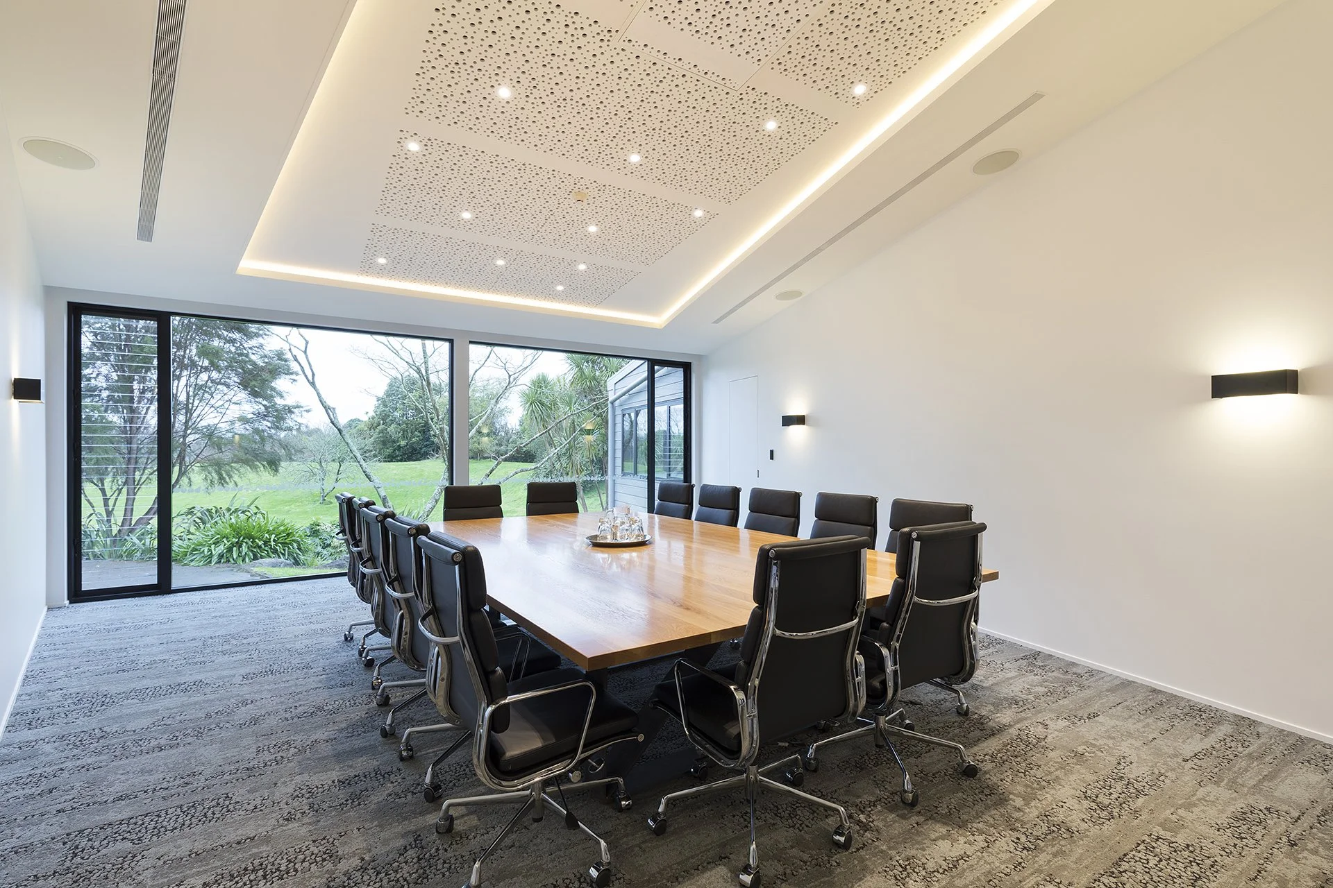
The Seeka Boardroom with custom solid oak boardroom table.
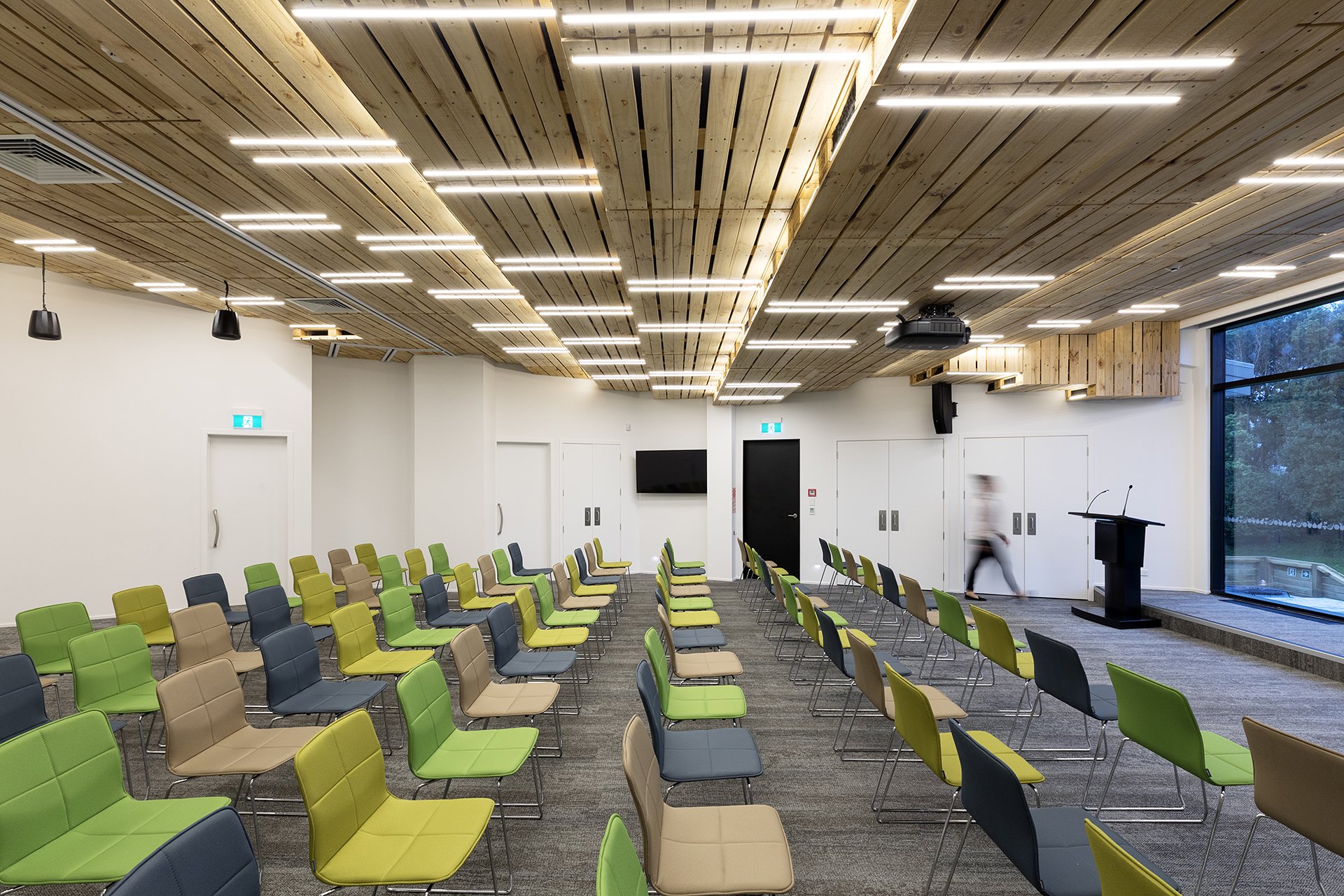
The conference space with up-cycled palette ceiling
PROJECT TEAM + SUPPLIERS:
Base Build Architect: Page Henderson
Main Fit-out Contractor:
Kitchen + Built-in Cabinetry:
Furniture: Mobel Group + ISSA Furniture
Photography: Amanda Aitken
*Winner of an NZIA 2018 Waikato/Bay of Plenty Interior Architecture Award, and Resene Colour Award.
See more Case Studies:
If you'd like to read more about why the briefing process changes everything before design starts, you can read more over on the Workspaces that Work Substack.