
HARCOURTS OPOTIKI
Taking Regional Real Estate to the Next Level
How a small-town agency built a workspace that could hold its own against any big-city office.

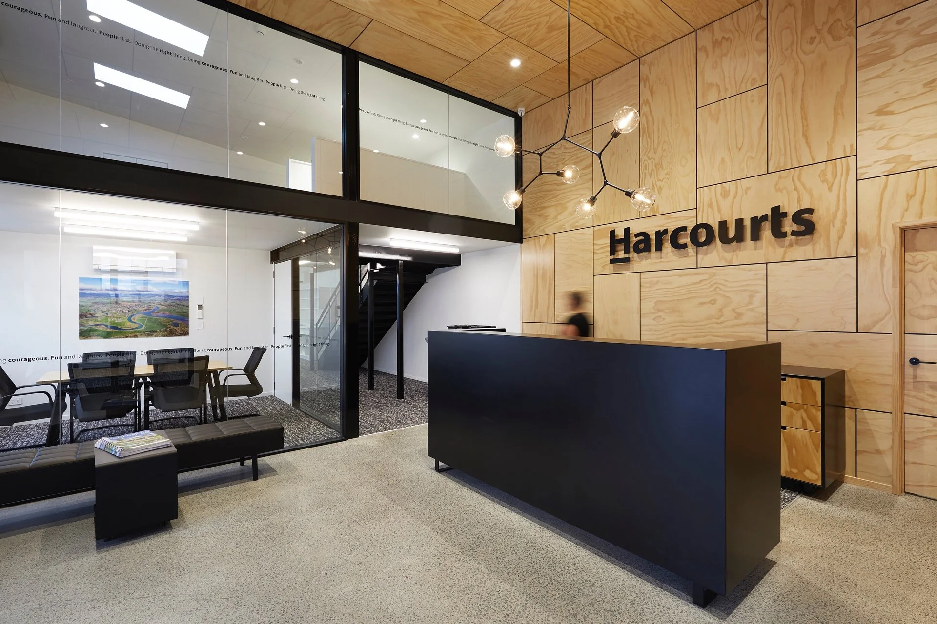
The stunning double height entry + reception with feature plywood panelling to the walls + ceiling
When Wendy, the Harcourts Ōpōtiki franchise owner, engaged us, she'd already made a bold decision: to convert a run-down, family-owned warehouse into new premises that would do two jobs at once.
A modern, high-performing real estate office for her team of ten. And a multi-purpose space the community could actually use - gallery, yoga studio, conference room, auction venue - depending on the day.
The brief, on the surface, looked like an aesthetic challenge. She had an idea she loved - plywood on the rear wall of reception, giving it warmth and character - and she needed help developing her vision and coordinating the right people to bring it to life. What sat underneath, though, was the more interesting problem.
Because Harcourts Ōpōtiki had genuinely grown up. The brand was strong, the team had momentum, the reputation in the community was solid. But the tiny prefab they'd been operating from still felt like the beginning of the story, not the chapter they were actually in.
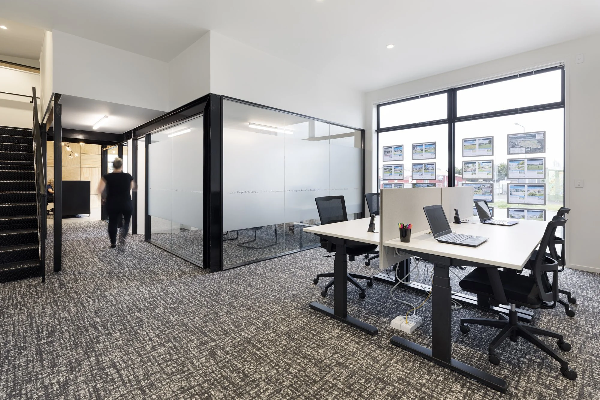
Wendy’s office adjacent to the sales team…

and the rentals team workspace off reception to the other side.
We started with flow, not finishes
When I first met the team, an architectural designer was already working on consent drawings. There was energy and momentum, which is great. But what wasn't yet clear was how the space needed to actually work - for clients and for the team, day to day.
So before I touched finishes or furniture, I stepped back and reworked the plan: flow, adjacencies, movement, zoning.
A large warehouse footprint is an opportunity, but it's also a risk. Without a clear spatial logic, you can end up with a space that looks transformed but still functions like a series of awkward compromises - sales and rentals bumping into each other, no clear client journey from arrival to meeting, an auction room sitting disconnected from the rest of the building, and large portions of the footprint drifting into dead space.
Getting that plan right first is the step that makes everything else make sense. The finishes, the furniture, the custom elements - all of it becomes clearer, and cheaper to execute well, when the layout is doing the heavy lifting.
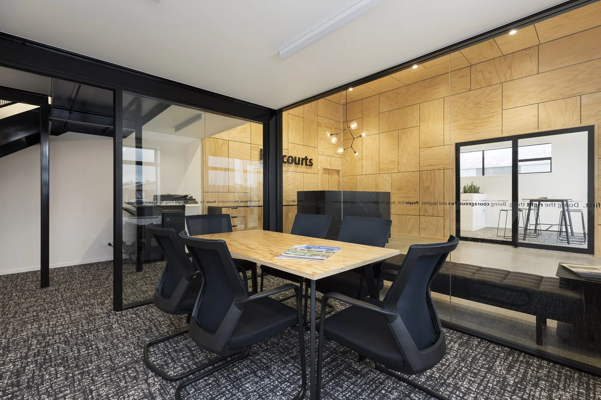
The reception with adjacent meeting rooms
Custom where it counts - cost-effective where it makes sense
A big part of making a conversion like this feel premium - rather than pieced together - comes down to choosing carefully where you go custom, and where you don't. Not everything needs to shout. When everything is trying to be the hero, nothing reads as intentional.
Here, the custom anchors were the reception desk and credenza, the full-height plywood wall with an integrated door connecting the kitchen zone to the rest of the building, and a built-in banquette between the breakout and auction room. These elements signal permanence and quality in a way that off-the-shelf furniture simply can't - and they lift everything around them as a result.
The supporting furniture was chosen to feel cohesive without needing to be expensive everywhere. That kind of decision is where experience saves money: understanding which moments matter enough to invest in, and which don't need to compete.
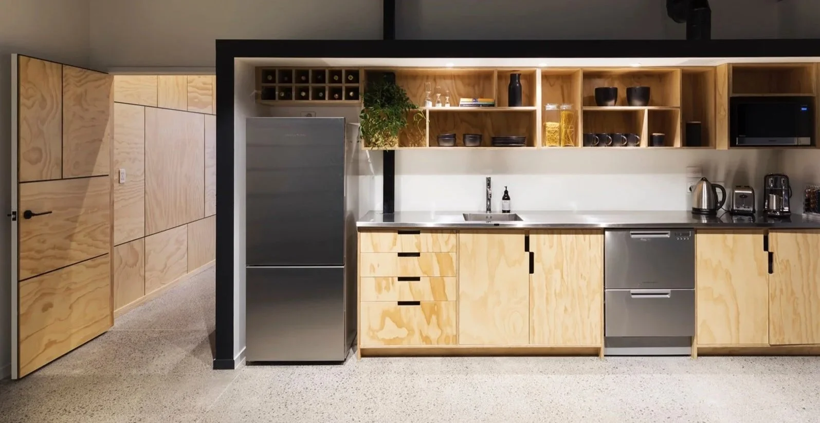
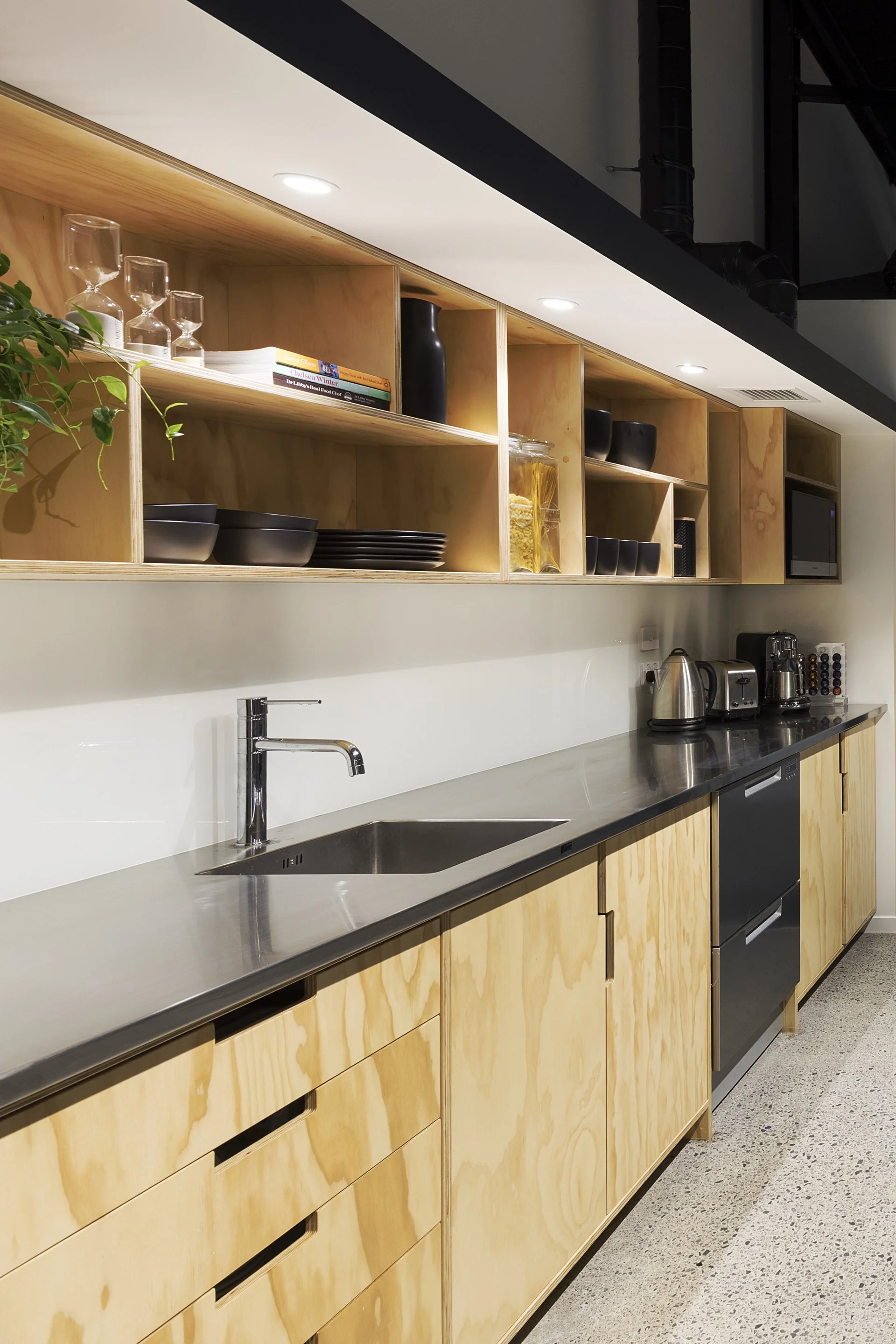
The staff + client kitchen tucked in behind reception
The plywood move
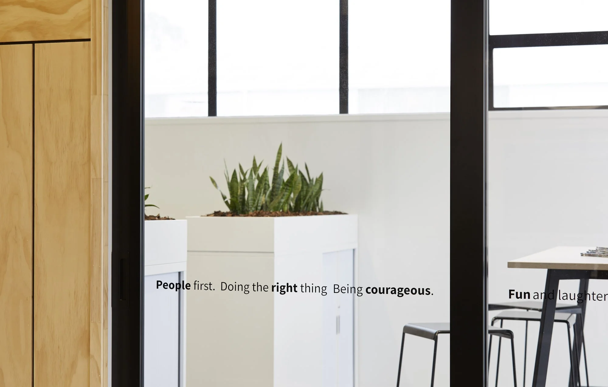
Wendy's original instinct was to clad the rear wall of reception in plywood - and it was a good one. We just took it “next level”, literally.. We expanded it into a full double-height statement: two walls and the ceiling, all in ply panelling with negative detailing, with the Harcourts wordmark mounted directly onto the timber. That same plywood language then continued through the staff kitchen and breakout area - including a full-height ply door that carries the material right through to the back of house - tying the project together with consistency rather than leaving each area to feel like a separate decision.
What you notice when you stand in that reception is that nothing feels arbitrary. Every panel, every join, the warm grain of the timber catching the light from the molecular pendant above. One material, applied with intention across walls, ceiling, and joinery, which became the signature of the whole project.

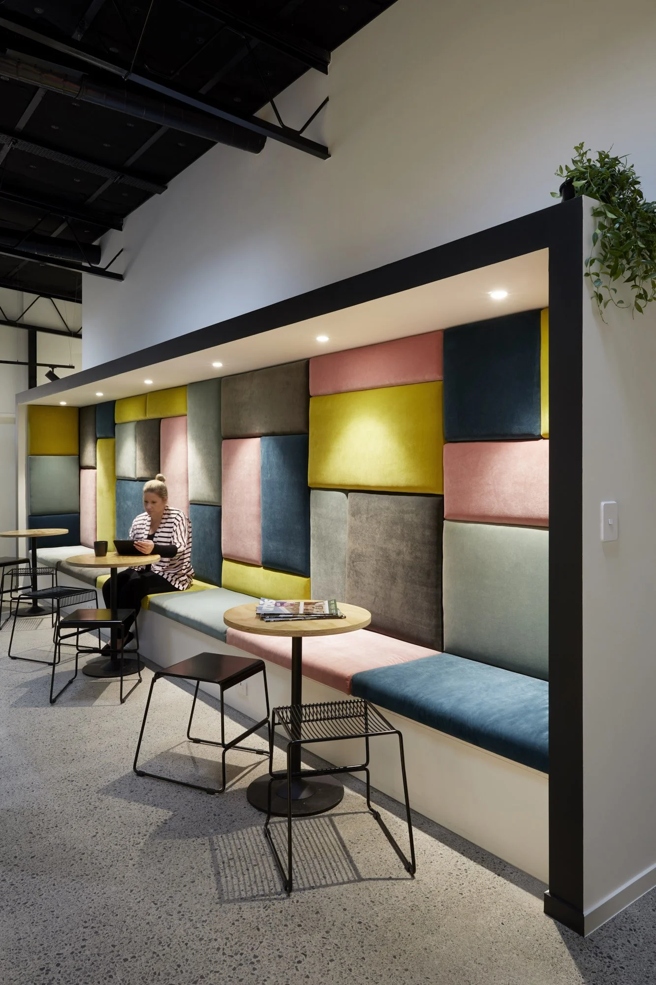
Designed for acoustics, this deliberately multi-purpose space in between the reception and auction room became the feature everyone remembers.
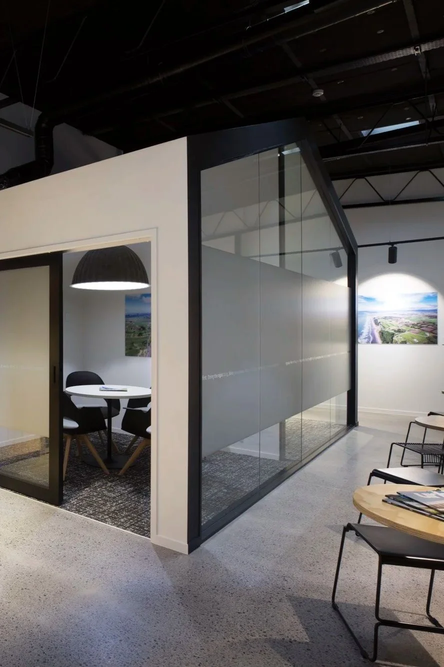
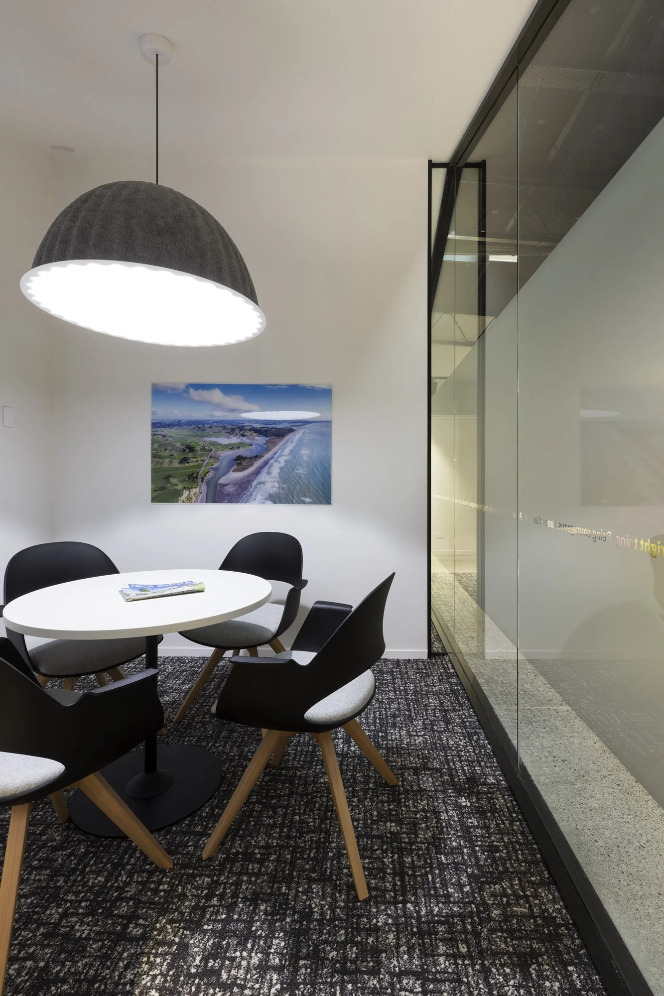
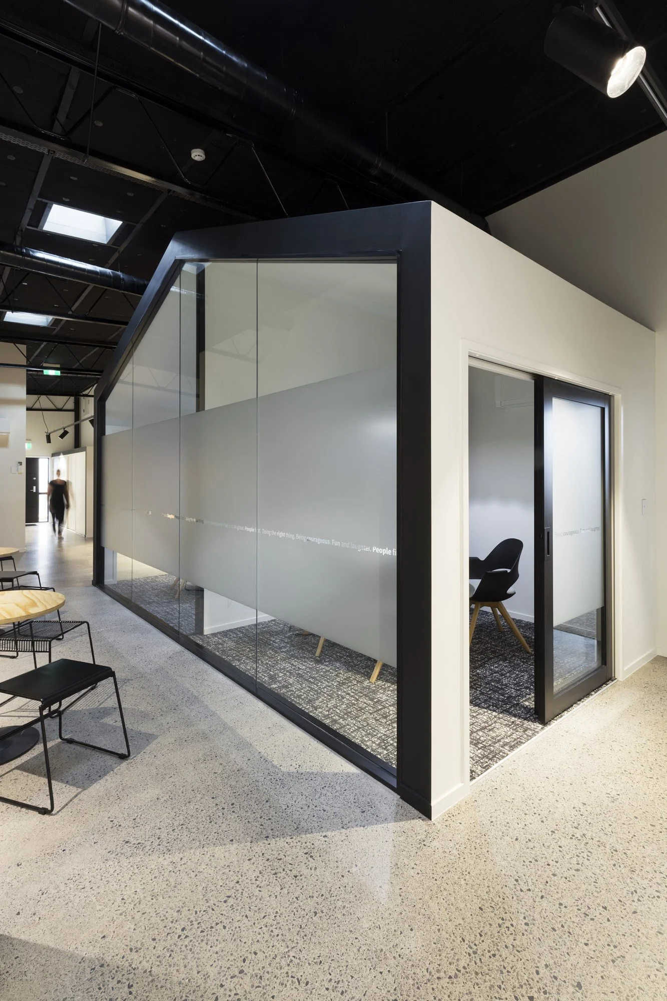
Turning the "dark zone" into an advantage
Most warehouse conversions have a tricky middle section - darker, lower, more awkward than the rest of the footprint. The instinct is often to minimise it or work around it. Here, I leaned into it. That central zone became exactly the right location for the enclosed glazed meeting and negotiation rooms, which the team uses daily. Because those rooms sit in the deeper part of the building, the brighter front-of-house stays open and welcoming - the arrival experience gets the volume and natural light, and the more private functions get the containment they need.
And then there is the banquette. Sitting between the breakout and the auction room, it was designed first as an acoustic solution - absorbing sound between two very different zones. But the brief we gave ourselves for the detailing was that it should earn its place visually as well. The result is a full-height built-in piece upholstered in bold panels of teal, pink, chartreuse, and grey - a patchwork of colour in a building that's otherwise warm timber and industrial black. It became the most-talked-about feature in the space, and the one that best illustrates why custom work communicates something off-the-shelf never quite can.
The community room
The large rear space - the one that became the auction room, the gallery, the yoga studio, the conference venue - is the part of this project that made it something more than an office refurbishment. The exposed steel truss ceiling, the clerestory windows bringing light deep into the building, the flexible furniture that can be arranged in rows for an auction or cleared entirely for an event. It's a space designed to earn its footprint every day of the week, not just for occasional big moments. And because it was planned as part of the overall zoning from the beginning - not bolted on afterwards - it connects logically to front-of-house in a way that makes it genuinely usable rather than just a room with a door on it.

The large multi-purpose auction room is also used as a community yoga studio + gallery space.
The outcome
What Wendy and her team ended up with wasn't just a better-looking office. It was a space that actually reflects the business they'd built - a Harcourts franchise with genuine presence in the community, operating at a level the old prefab never could have communicated. The arrival experience immediately positions them differently. The team has real workflow. The culture is visible in the architecture. And the warehouse footprint, which could easily have drifted into dead zones and awkward compromises, earns every square metre.
“We so enjoyed our dealings with Rachel and Nalani at Bubble Interiors, and it was awesome having them to source the best people for the different aspects of the rebuild and refit of a substantial older building.
They were involved early in the rebuild process, so did much more than just interior design. We felt Bubble Interiors never lost sight of our original brief, and therefore feel that we got what we wanted, and so much more.
We are very happy with the finished premises and glad that we trusted their design concepts and implementation of them. Without them we wouldn’t have the fantastic office space we now have.”
BUBBLE INTERIORS’ SCOPE:
Space Planning, Concept + Developed Design
All finishes selections
Design + detailing of staff kitchen + reception counter/credenza
Procurement of full FF&E package
Co-ordination of trades to install aluminium interior partitioning + glazing, feature panelling in reception, plus flooring
“Soft” Project Management overseeing installation of cabinetry + arrangement of furniture.
PROJECT TEAM + SUPPLIERS:
Base Build Documentation + Consent: SJR Architectural Design
Base Build Contractor: PJ Brown Builders Ltd
Interior Partitioning: C&I Systems
Feature Ply Wall Panelling, Kitchen, Custom Reception Desk + Credenza: Modern Kitchens
Flooring: Inzide, Van Dykes Flooring Xtra
Lighting: Douglas + Bec, Muuto, iBex
Furniture: Mobel Group, ISSA Furniture, Cintesi
Signage:
Photography: Amanda Aitken
Completed June 2018
If you'd like to read more about why the briefing process is the most important part of any office project, I've written about it over on the Workspaces That Work Substack.